Sales 888-926-4665
Support 888-923-2604

Expand search form
  • Home
  • About Us
  • Services
    • Paid Search
    • Dynamic Inventory Based Ads
    • Remarketing
    • Facebook Retargeting
  • Blog
  • Contact Us

Category Archives: Google

Posted:
Friday, February 12, 2016

Tags:
Ads, AdWords, Google Technology, ppc, User Stats

Google Vehicle Dealer Report For Q4 2015

Google recently released their Vehicle Dealer vertical report for the Q4 of 2015. The data yielded some interesting data that shed some new light on the vertical and reinforced past trends. According to the report search queries in the Vehicle Dealers Category grew by 13%. Interestingly, Desktop searches declined by 3 percent and Tablet queries declined by 5 percent, while Mobile queries grew by 33%. This is not groundbreaking news, but it does reinforce the fact that mobile traffic is increasingly becoming a larger part of the pie.

The report also shed some light on interesting trends in regards to the paid search auctions on Google search results.

Q4 2015 Google Auction Data
Queries, Impression and Clicks saw huge increases for Mobile on the Adwords search auction. On the contrary, those same metrics saw a decrease on desktop – no surprise there. An interesting trend that I wasn’t aware of was that Ad Depth decreased quite significantly for desktop queries, a drop of 8.79%. The Ad Depth refers to the number of ad placement spots for a particular search query. A near 10% drop in Ad Depth means that a search term that used to yield 10 search ad spots may only be showing 9 ad spots now. One less ad spot on the search results page means a decrease in impressions and a rise in CPC as the same number of advertisers competes for even less ad space. If your dealership Adwords campaign saw a rise in CPC in the past 3 months then this may be a contributing factor.

The big takeaway from Google’s report is that mobile traffic and desktop traffic is trending in opposite directions. In fact 62% of all searches in the Vehicle Dealers vertical are made on mobile or tablet devices. So what does this mean for car dealerships? Well, it means having a mobile responsive website and a digital advertising strategy to reach mobile users is even more important and increasing by the day.

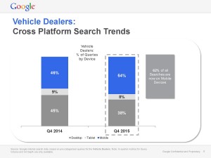
Q4 2015 Google Device Chart

Read More

Posted:
Friday, May 15, 2015

Google Mobile Algorithm Changes

The purpose of this article is to provide information to automotive dealers about Google’s new indexing changes and the technology and opinions related to them. The article has links to all my research for you to expand in the topic.

It is safe to assume that by now we have all heard that Google rolled out a “mobile-friendly update” (1) on April 2014. It is important to understand these changes as they are the beginning of the way our websites will be accessed by our customers. We are moving from desktops to mobile devices and the way Google will work for these is changing.

The update will begin to change how Google ranks and indexes website content for mobile searches. This is an update to force website owners to improve their websites so they are mobile compatible. You can no longer ignore mobile traffic. Period.

Google’s goal is to offer mobile friendly links on search results therefore improving customer experience on their search engine.

Moz (2) analyzed the changes in traffic globally (not just automotive industry) and they haven’t been very relevant. So far this update hasn’t been a big deal as you can see in their “7-day analysis” (3). But don’t think this is over, here is why:

The algorithm change only affects mobile (cell phone only, no tablets!) searches, not desktop.
Most companies that were already ranking well for high value keywords were already mobile friendly.
The changes will take time to spread, re-index, and notice changes-if any.

On a side note and quoting Google (4) about content and the effects of the mobile changes: “The intent of the search query is still a very strong signal — so even if a page with high quality content is not mobile-friendly, it could still rank high if it has great content for the query.” Google will prioritize indexing of high quality useful content versus just the fact that the architecture of your site is mobile friendly. In my opinion this should be specially noted for long tail searches.

Google is looking to bring content parity (5) so the websites “provide the same content to both mobile and desktop visitors”. Your customers (and now Google!) “expect to be able to do anything on their devices that they can do on a desktop”. We are breaking very fast the myth that consumers will not perform certain tasks on a mobile device VS desktop, data shows the opposite, mobile devices are becoming the center of how we look for content and interact with products.

You can check if your website is mobile friendly by using this free tool provided by Google: Mobile friendly test (6).

However here are a couple things you should know about that tool. Most automotive dealerships have what is called “adaptive website platform” (7). When a customer types a URL on a mobile browser or clicks on a link on a smart phone, the server knows the request is coming from a certain type of device therefore changing what the server shows. In essence you have 2 different websites; one for desktops and one for mobile devices. The issue with that is that customer experience is not equal from device to device; not all 3rd party tools, links, calls to action, etc are always equally positioned or even existent on all devices. An “adaptive website platform” still passes Google’s test because webmaster can add a piece of code that tells the tool that a mobile version of the site exists in the server and therefore the tool approves the site.

We also have in the industry what we call “responsive websites” (8). Responsive websites are not just a way to pass Google’s test but a new way to look at how we progress into the changes from desktop to increasing mobile and tablet traffic (note also the arrival of the desktop tablets (9)). In layman’s terms (spoiler alert: we produce this website) automotive responsive website systems (10) offer customers exactly the same website regardless of the device used so the website the customer experiences is always the same regardless of the screen size in use.

There is an evolution happening in front of our eyes from a desktop sized screen to a multi sized screen. The changes are also intrinsically related to site speed; while most desktops are connected to broadband mobile devices still suffer from connectivity. Site speed is a consideration (11) for 2014 and it will increase in years to come.

Our approach to responsive (DealerLab.com and Dealereprocess.com (12))has been an specific technology called RESS (13). RESS technology allows the websites to control the load based on device and therefore the website’s loading speed. This technology is a must for automotive websites where the SRP (Search Results Page) and the VDP (Vehicle Details Page) are loaded with image files. You can see the need of RESS when website companies have to revert to use “flex systems” that in reality are not fully responsive as they fall back in adaptive technology. There are plenty of articles to expand on RESS (14) technology and how this can benefit automotive e-commerce.

What should I do as an automotive dealer?

Understand that:

  • Digital marketing/indexing is shifting to mobile devices.
  • Content is a great indexing factor.
  • Site platform is relevant to performance.
  • Responsive websites are the future for consumer experience.

Yago de Artaza Paramo
CEO, PGI Digital
[email protected]

  1. http://googlewebmastercentral.blogspot.com/2015/04/rolling-out-mobile-friendly-update.html
  2. https://moz.com
  3. https://moz.com/blog/day-after-mobilegeddon
  4. http://googlewebmastercentral.blogspot.ca/2015/04/faqs-april-21st-mobile-friendly.html
  5. http://insights.mobify.com/what-is-mobile-seo-faqs/
  6. https://www.google.com/webmasters/tools/mobile-friendly/
  7. http://en.wikipedia.org/wiki/Adaptive_web_design
  8. http://en.wikipedia.org/wiki/Responsive_web_design
  9. http://www.microsoft.com/surface/en-us/products/surface-3?SEMID=1&WT.srch=1&ocid=ONECONSTABS3_SEM_GOO_Generic_AW_en-US_tablet&wt.mc_id=ONECONSTABS3_SEM_GOO_Generic_AW_en-US_tablet
  10. http://www.northwesthonda.com
  11. http://www.searchenginejournal.com/seo-101-important-site-speed-2014/111924/
  12. http://dealerlab.com & http://www.dealereprocess.com
  13. http://www.lukew.com/ff/entry.asp?1392
  14. http://www.smashingmagazine.com/2013/10/08/responsive-website-design-with-ress/

The post Google Mobile Algorithm Changes appeared first on Paramo Group.

Read More
1 2 3 … 7 NEXT

Archives

  • February 2016
  • October 2015
  • May 2015
  • November 2014
  • October 2014
  • September 2014
  • August 2014
  • July 2014
  • June 2014
  • May 2014
  • April 2014
  • March 2014
  • February 2014
  • January 2014
  • December 2013
  • November 2013
  • September 2013

Search By Category

Advertising analytics Auto Dealer Marketing automotive conference automotive sem automotive seo Benefits Bing Ads Blog Blogs car dealer websites chat Content Marketing Craigslist Dealer Lab dealerlab dealer news dealer websites Digital Marketing Dustin Moore facebook Features Google google indexing integrated ppc Jim Gillen Kevin Drongowski Lead Creation Marketing menu mobile mobile sites News / Blog Newsletter Nick Gorton PPC Products sem SEO seo content Sok Khann Statistics system tools system updates Yago Paramo

Contact Sales

Sales: 888-926-4665

Sales E-mail: [email protected]


Contact Support

Support: 888-923-2604

Support E-mail: [email protected]

Contact Us

Name*

E-mail*

Recent News

Facebook Ads For Car Dealerships

February 19, 2016

Google Vehicle Dealer Report For Q4 2015

February 12, 2016

Digital Radio Ads For Car Dealers

October 5, 2015

Integrated PPC


PPC for car dealers. We offer industry leading service and results.

What is PPC? PPC stands for pay-per-click. PPC is internet marketing in which advertisers pay a fee each time one of their ads is clicked. It’s a more reliable way to drive leads to your website than through organic SEO. Learn more.

Google Partner Badge
  • Paid Search
  • Inventory Ads
  • Remarketing
  • Facebook Ads

Integrated PPC © 2014   |   Privacy Policy   |   Paramo GroupAutomotive Digital Agency